LOGO design
LOGO design
Frankie
kastenbaum
Frankie
kastenbaum
Frankie
kastenbaum
FRANKIE
KASTENBAUM
FRANKIE
KASTENBAUM
FRANKIE
KASTENBAUM
Frankie

GOAL of project
Fitness is a passion of mine, therefore I wanted to focus on it while I learned to use Figma.
overview
Recently, HomeBody has seen a surge of new users who are leaving the gym to exercise from home more.
They want to set these users up for success by recommending them the best possible workouts.
who WAS interviewed
I was interested in understanding the user, so I conducted further research to gain a better understanding of the equipment they own and their specific concerns with existing competitor apps.


After completing the additional interviews, I summarized the findings in order to capture the main insights.
competitor analysis
Before diving into the solution of HomeBody, I researched other apps on the market to see what worked well for them.
I looked at fitness apps and other apps whose onboarding processes were easy and simple to use, while accomplishing their tasks at hand.

problem statement
Video of my app
How might we create an onboarding process that helps new users find the perfect at-home workout program?
persona

To make sure I always had the user at the forefront, I created a character that was a compilation of the all users interviewed.
how research informed the design
As a means to make sure the user’s needs were taken into account in the design stage, I correlated insights directly to design features.

mid-fidelity annotations
Before jumping into the branding of the app. I wanted to first test the functionality.
Users were asked to move through the app as if they had just downloaded it from the app store
Overall, users easily moved through the app and understood where to go next. Problems occurred with the screen showed below.

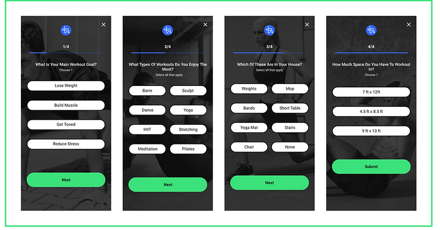
Users were confused by the wording on this screen. They suggested changing the options to specific measurements instead of arbitrary amounts of space.
hi-fidelity wireframes
Once I had a better understanding of how users reacted to the functionality of the app, hi-fidelity wireframes were created by adding in color, images, and further branding.

what users say

highlights & Design decisions

During the interviews, users emphasized their struggle with existing workout apps assuming users had space and equipment necessary to workout.
Therefore, these two questions within the onboarding flow seemed unique, but also necessary.
As well as the tag on the video icons allows users to quickly know this information when using the app.
Users also emphasized their struggle with existing workout apps where they go through the onboarding process and are then asked to log in, causing users to fear their preferences would be lost.
Therefore, I created the flow of HomeBody with the sign-in screen first.


Users also highlighted that they got frustrated when they got to a workout but then was told it was not accessible on the free version.
Therefore, this pop-up aimed at alleviating this frustration by showing that users that they had access to the entire app for a 14 days trial period.